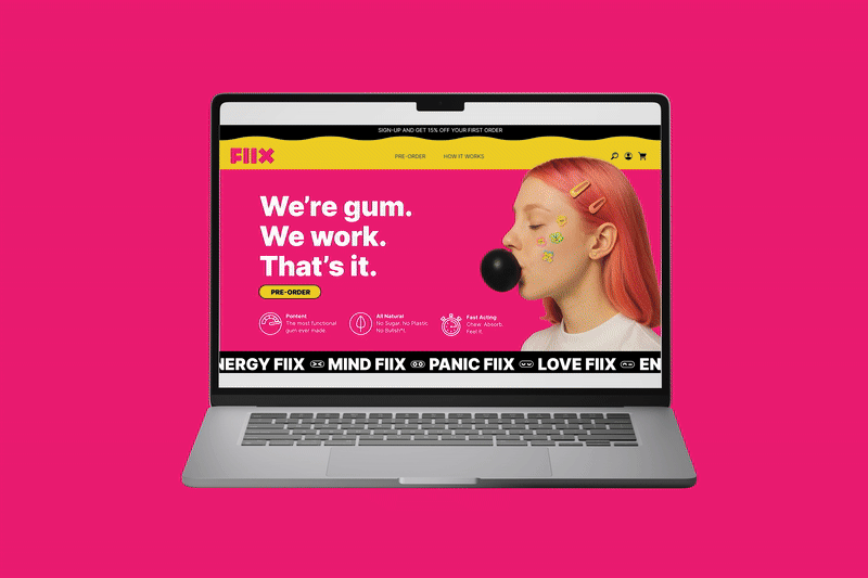

FIIX Gum
Fiix Gum is functional gum that actually does something. Each piece is powered by the FIIXcore™ stack plus targeted botanicals to give you clean energy, sharp focus, calm control, or a boost in desire—fast. No plastic, no sugar, no bullshit. Just gum you can chew, swallow, and actually feel working.
-
Color System
Hot Pink (#E10073 range): The hero color, loud and unapologetic. It communicates energy, sex appeal, and cultural edge. On the site, it dominates backgrounds, creating instant recognition.
High-Contrast Accents (Yellow & Black): Yellow is used for calls-to-action (Pre-Order, Warning labels), reinforcing urgency and energy. Black provides grounding, adding clarity and a sense of authority.
Secondary Pops (Green, Purple, White): Used sparingly to separate product tiers (Mind, Energy, Love, Panic) and to keep each SKU distinct but still inside the same system.
Typography
Heavy, Geometric Sans Serif: Blocky, bold, and extremely legible. It mirrors the gum’s square/X geometry. The copy is direct, almost blunt (“We’re gum. We work. That’s it.”), which amplifies the brand’s no-BS persona.
Hierarchy via Weight & Color: Big, in-your-face headlines in white or black over bold pink backgrounds. Secondary text uses yellow and black for emphasis. There’s no subtlety — it’s intentionally maximalist.
Graphic Language
X Iconography: Repeated throughout. On packaging, comparison charts, and FAQ sections, the X motif doubles as both branding and function.
Pop-Culture Aesthetic: The imagery (girl with gum bubble, stickers on cheeks, bold product shots) channels fashion editorials and internet culture — ironic, playful, edgy.
Modular Grids: Each section is clean and compartmentalized. Despite the loud palette, the site feels structured — a nod to the gum’s geometric identity.
Photography & Visual Tone
Surreal + Playful: Gum treated as art object (hand shots, floating pieces, bold macro imagery).
Youth-Culture Anchored: Bright hair, stickers, playful styling connects to Gen Z/millennial aesthetics.
Contrast as Drama: Pink backgrounds + black gum + neon accents = high tension, high visibility.
Brand Personality on Display
Direct: “We’re gum. We work. That’s it.” — the messaging and layout are as punchy as the visuals.
Edgy & Irreverent: FAQ cards and comparison tables lean into humor + bluntness, which breaks away from clinical or wellness clichés.
Cultural Currency: The website design looks like a mix between a Supreme drop page, a pop-art zine, and a high-fashion lookbook. It signals FIIX isn’t just a supplement — it’s a brand you flex.
-
Fiix’s voice is sharp, funny, and unfiltered—science with a smirk. It says what people are really thinking, whether that’s calling out caffeine dependence, fake “blue razz” flavors, or the absurdity of swallowing gum. The tone mixes functional clarity with irreverent humor: direct, witty, sometimes dark or crass, but never fluffy or preachy. Ingredient callouts are explained with real science, then undercut with a punchline that makes them memorable. Fiix doesn’t overpromise—it admits gum won’t solve your life, but it will keep you awake, focused, calm, or turned on long enough to deal with it.
-
Fiix wasn’t just branded, it was built from the ground up. We handled the full product development process—formulating the FIIXcore™ stack, sourcing clean, functional botanicals, and dialing in targeted blends for Energy, Mind, Love, and Panic. That meant balancing efficacy with taste, stability, and fast delivery: freeze-dried natural fruits for flavor, a chicle base so it’s swallowable, and ingredient combinations that actually work instead of just sounding good on a label. The result is gum that looks sleek, tastes real, and hits fast—backed by formulation, testing, and iteration at every stage.
-
The Fiix website is sharp, bold, and irreverent—built to both educate and entertain. It’s structured around the four core products (Energy, Mind, Love, Panic) and uses a mix of science and humor to explain what’s inside, how to use it, and why it works. Ingredient callouts are paired with cheeky one-liners, while sections like “Gum You Can Swallow” and “What We Leave Out” reinforce the anti-bullshit stance. Customer reviews, science blurbs, and clear support links add credibility, but the overall tone stays playful, blunt, and culturally subversive—making the site feel more like a brand experience than a traditional supplement store
-
Fiix packaging is loud, bold, and impossible to ignore. Each pack uses high-contrast colors, oversized typography, and cheeky warnings to flip traditional supplement design on its head. Instead of wellness fluff, it shouts Sugar Free × Plastic Free × Bullsht Free* and delivers it with humor and attitude. Inside, bright yellow trays and jet-black gum pieces turn a daily habit into something that feels more like a statement than a supplement.
-
Fiix’s psyche is built through Shade Tactics, because we treat brands like people—layered, complex, and evolving. At its surface (Shroud), Fiix shows up as a Harlequin: witty, irreverent, entertaining, and disruptive. At its core (Helm), it thinks like an Anarchist: uncompromising, rebellious, and designed to challenge broken norms in wellness. The brand’s soul (Anchor) carries the Mother archetype—empathic, protective, grounded—making sure the irreverence is always backed by care and actual utility. Its shadow (Darkling) is the Sovereign: over-polished, rigid, controlling, and everything Fiix refuses to become. Finally, Fiix’s mirror (Echo) is the Wallflower: approachable, community-oriented, and relatable, ensuring the brand connects with real people instead of performing aspirational wellness .